Creative work 22nd-29th Nov 2021


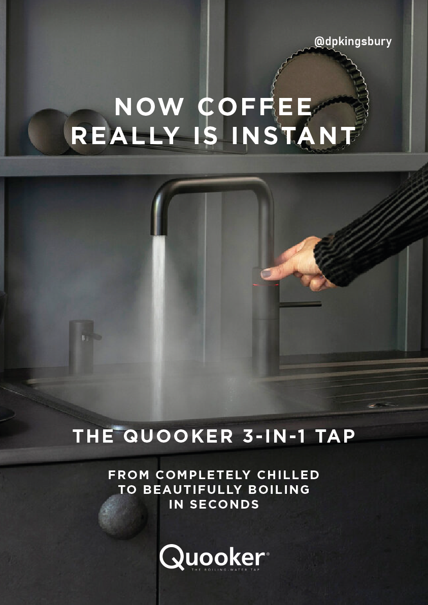
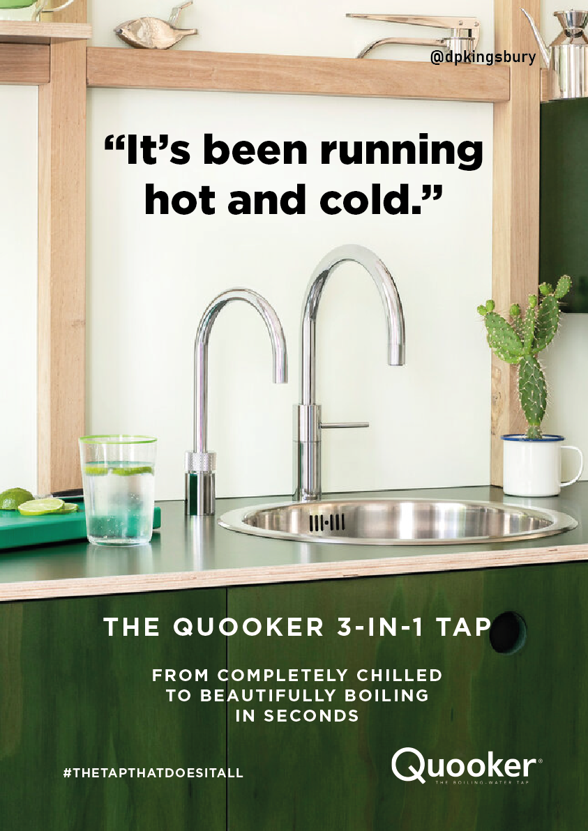
Client: Quooker
Brief: Create posters to promote the Quooker 3-in-1 tap
Quooker taps have a USP of being the only tap that can provide both chilled and 100°C boiling water. They also have a classic, stylish design. I came up with a few copy ideas emphasising these features. Product shots were provided by the client.
My “Chilled, sparking, boiling” entry was shortlisted, while the “Running hot and cold” entry was popular with the Twitter community.
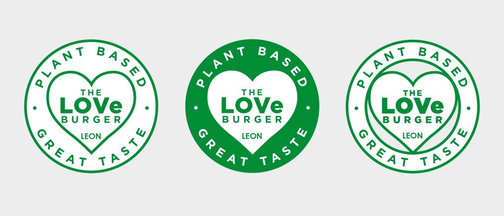
Client: LEON
Brief: Create a refreshed logo for the LEON LOVe Burger that captures the essence of love and the power of plant-based eating.
No copy or ad writing here. Just a straight-up design brief. My original concept was to design the logo around a leaf that resembled a heart, but I couldn’t execute it to my satisfaction within the time constraints I imposed (I usually only spend around 30 minutes on submissions for One Minute Briefs). The old logo felt dated and had a lot going on, so I created a clean, contemporary logo as a counterpoint to this instead. The lower-case e in LOVe signifies that the product is vegan.
I think the logo is fine in a vacuum, though it doesn’t capture LEON’s brand personality well. If I were to spend more time developing it, I would work in some more playful elements that give a visual nod to the nature of the product and better capture the brand personality.
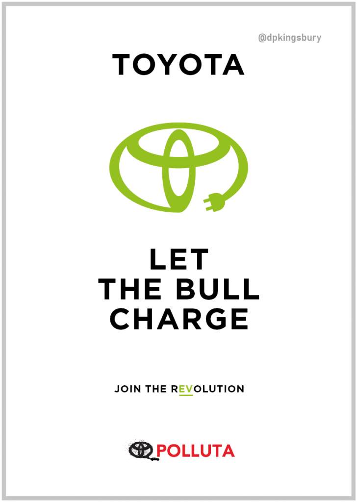
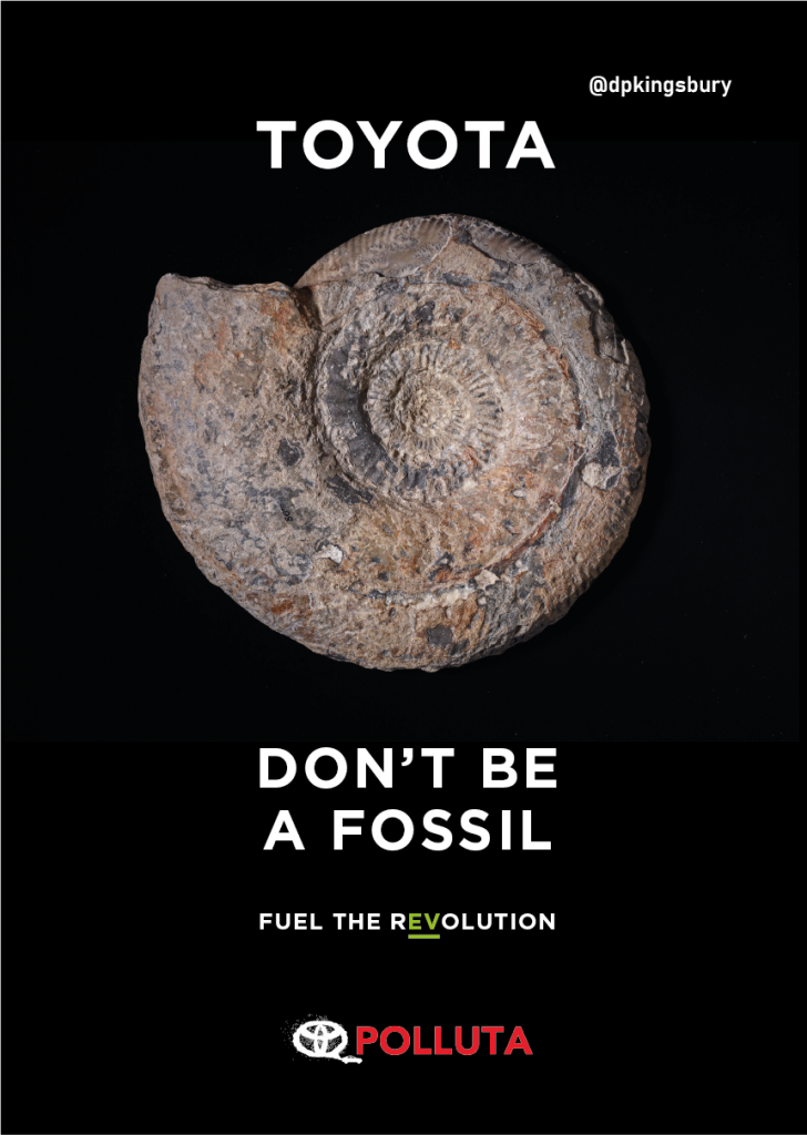
Client: Polluta
Brief: Create posters encouraging Toyota to stop lobbying against climate regulations, and switch over to making 100% battery electric vehicles instead.
I love a good ethical campaign brief and enjoyed this one immensely. For those who don’t know, the Toyota logo was designed to represent a bull. I immediately saw the potential to doctor the logo to include an electric plug on the bull’s tail. I also changed the logo colour from Toyota’s signature red to a verdant green, emphasizing the sustainability message. With that done, I also saw an opportunity to play on the dual meaning of the word “charge”, as it relates to a bull’s natural behaviour and to electric vehicles, (which, obviously, must be charged). I thought this was a strong marriage of copy and design.
My second concept also played on a dual meaning, this time of the word fossil. The current motor industry trend is towards electric vehicles, so those still focused on petrol vehicles are following an old fashioned strategy and risk becoming history, or “fossils” within the industry.
I split the term “fossil fuel” across two statements, using fossil to refer to the past and fuel as an action word directed at the new way of doing things. I underlined and highlighted the ev in revolution green as a subtle design touch referencing electric vehicles. Now all that was left to do was add a strong stock image of a fossil to drive the message home.
While I thought the charging bull ad was a stronger piece of work, it was the fossil ad that was shortlisted.
If you’d like me to work on a creative ad project with you, drop me an email. I’m always happy to lend my copywriting and design skills to creative ad campaigns and I’d love to hear from you.