
Client: Biotiful
Brief: Create billboard-style posters to communicate to young people (18-40 years old) to #BeBiotifullyYou with Biotiful Kefir.
The product here is a dairy-free pro-biotic yoghurt/yoghurt drink alternative, with photography provided by the client. I tried a couple of design and copy approaches to position the value prop to the intended audience.
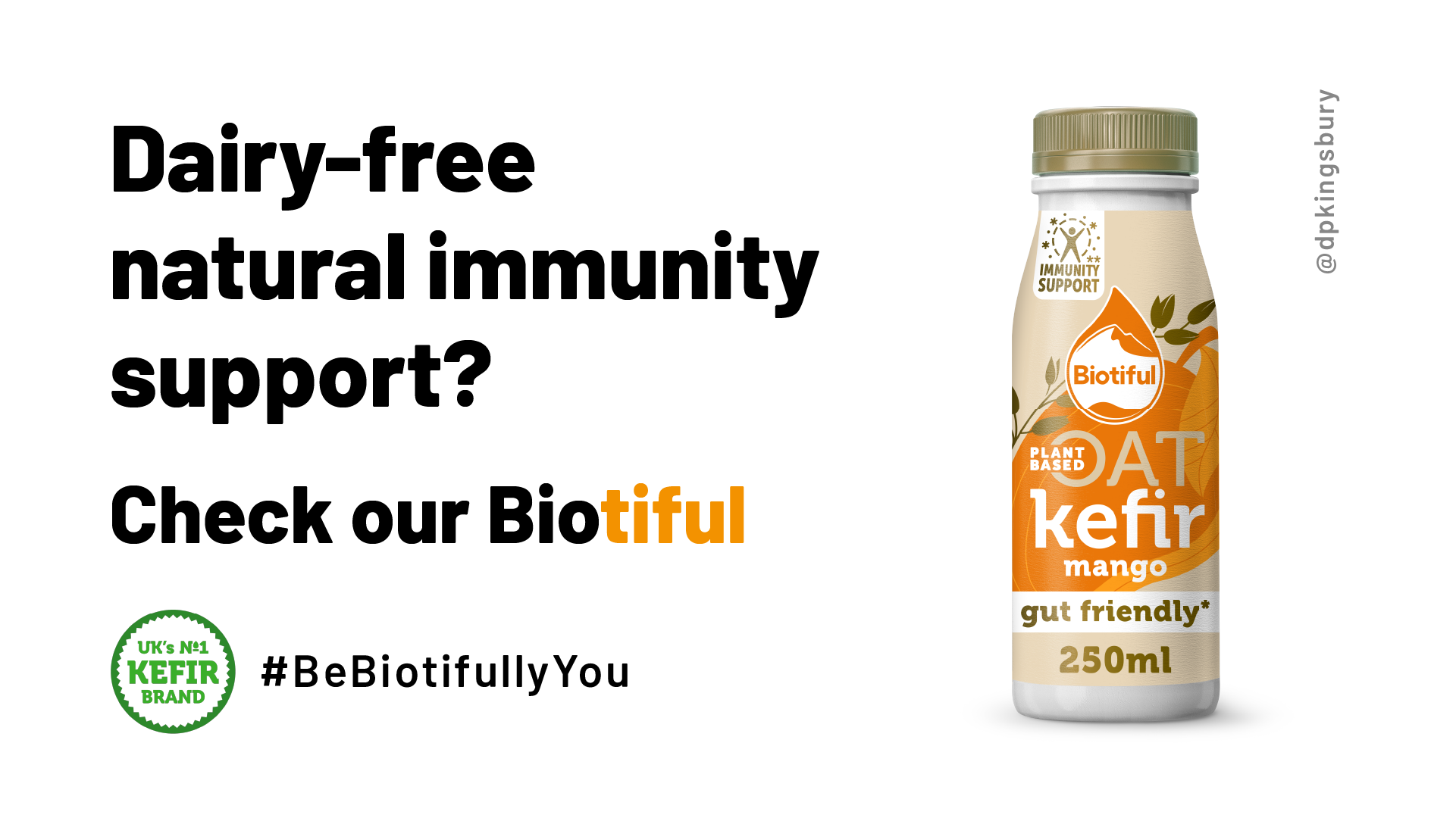
The first design concept was around a large single packshot. The copy in my first variation focuses on the gut health angle, as this is the product’s key benefit. I used a play on words based on the common phrase “Drink to your good health” to communicate this benefit in a humorous, memorable way.
With the second variation, I highlighted the dairy-free nature of the product to appeal to the growing vegan market. I made a cheeky nod to Instagram in the CTA, highlighting the “Bio” portion of the brand name to appeal to the millennial target market. The clearer value prop and targeted CTA make this a stronger ad than the first variation.
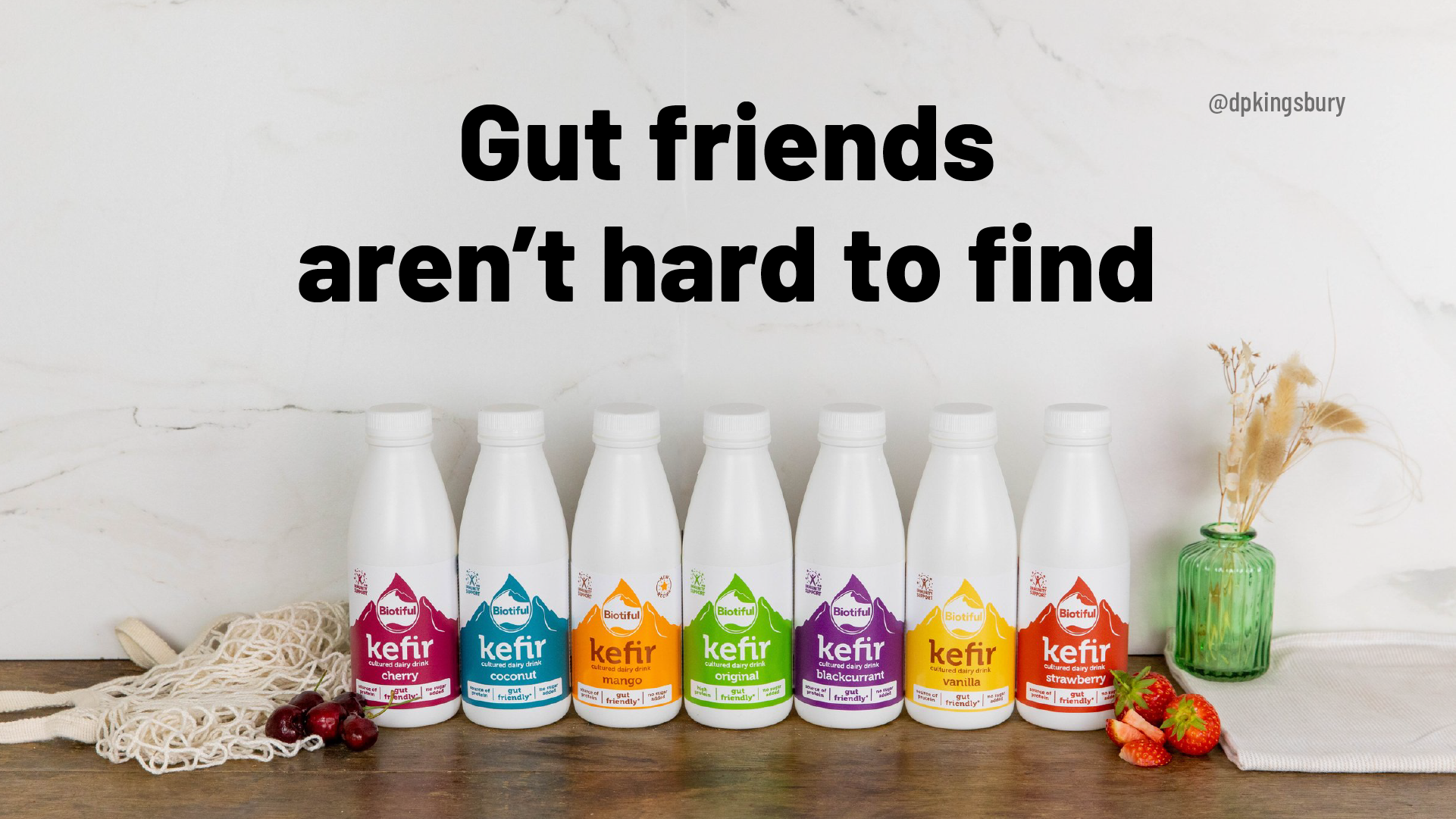
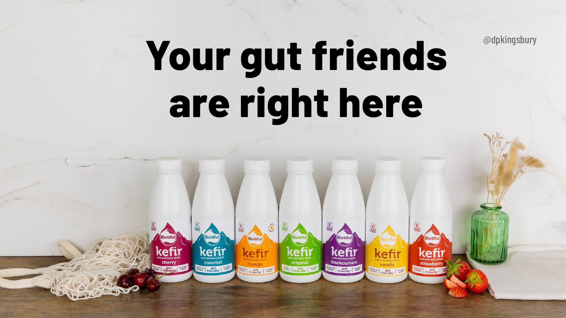
My third and fourth variations are the same concept with slightly different copy lines that both play on the idea of “good friends.” For me, the strength of these ads is that the friendship angle of the copy creates a positive emotional connection and trust in the viewer’s mind. The packshot also displays a range of products, giving it a broader appeal than a single product.
The downside is that the value prop is a little vague and possibly not strong enough for the copy line to stand on its own. A supporting copy line that clarifies the offer is probably needed to make people act on the ad. Despite this, the third variation proved popular on Twitter.
Client: Canva
Brief: Create posters that bring to life how easy it is to edit photos on mobile with Canva
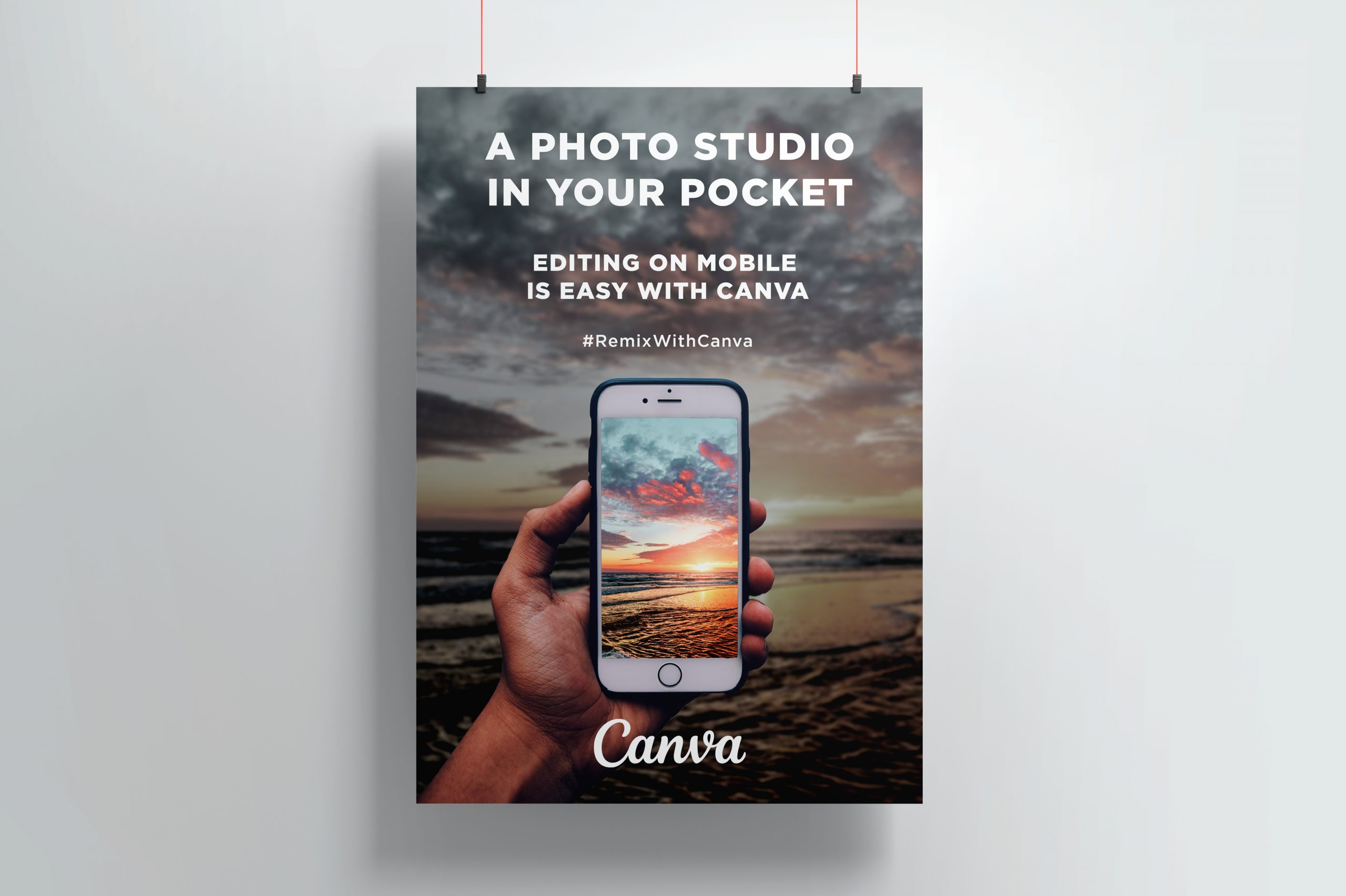
In this ad, I wanted to emphasise the product’s power, simplicity, and portability. I picked a strong background image from stock to capture people’s attention, then placed a hand-held phone in the centre of it. An enhanced version of the scenic image is displayed on the phone screen to show how the product can improve the user’s photographic results.
The copy line is influenced by Apple’s classic “1,000 songs in your pocket” iPod ad — I think it does a good job of emphasising the qualities of power, simplicity, and portability as per the brief and my original goal.
If you’d like me to work on a creative ad project with you, drop me an email. I’m always happy to lend my copywriting and design skills to creative ad campaigns and I’d love to hear from you.